
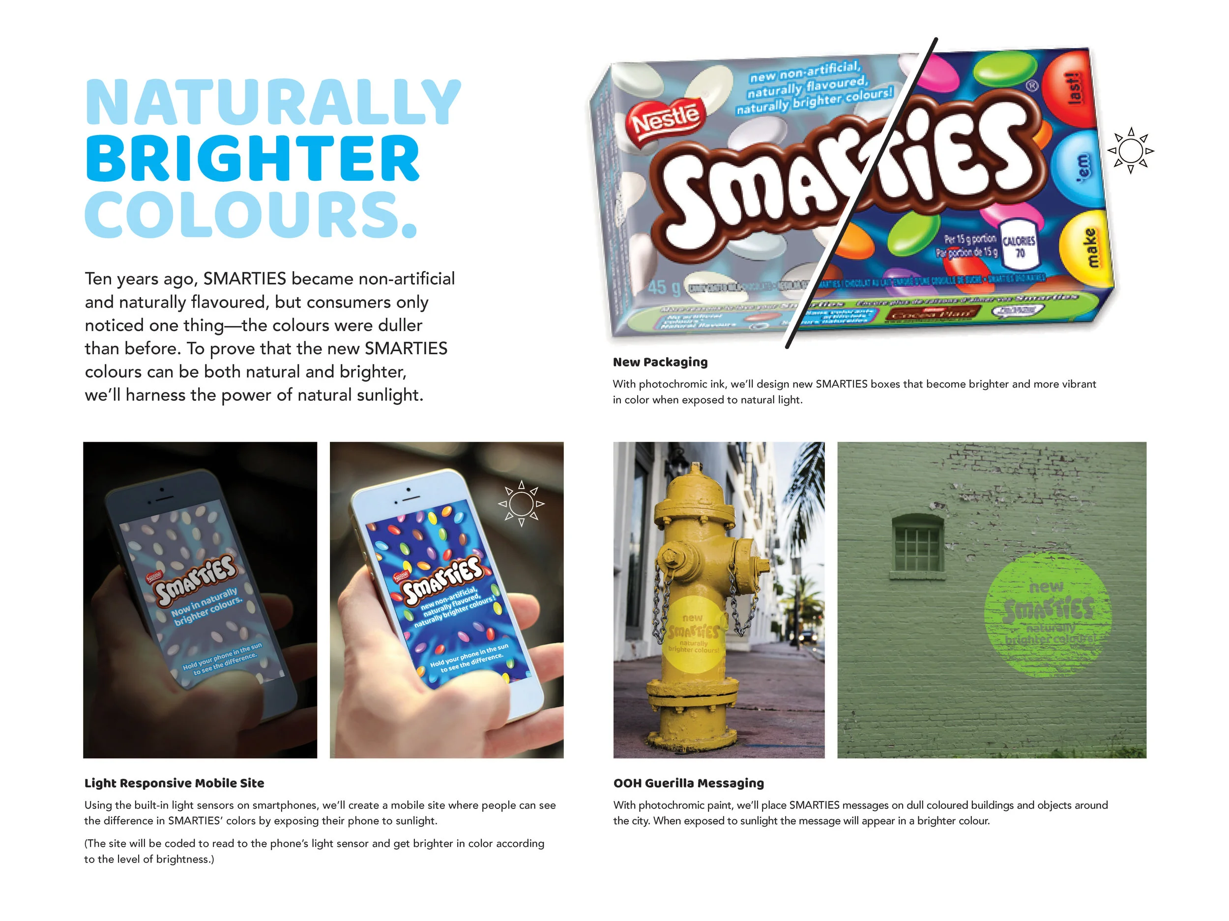
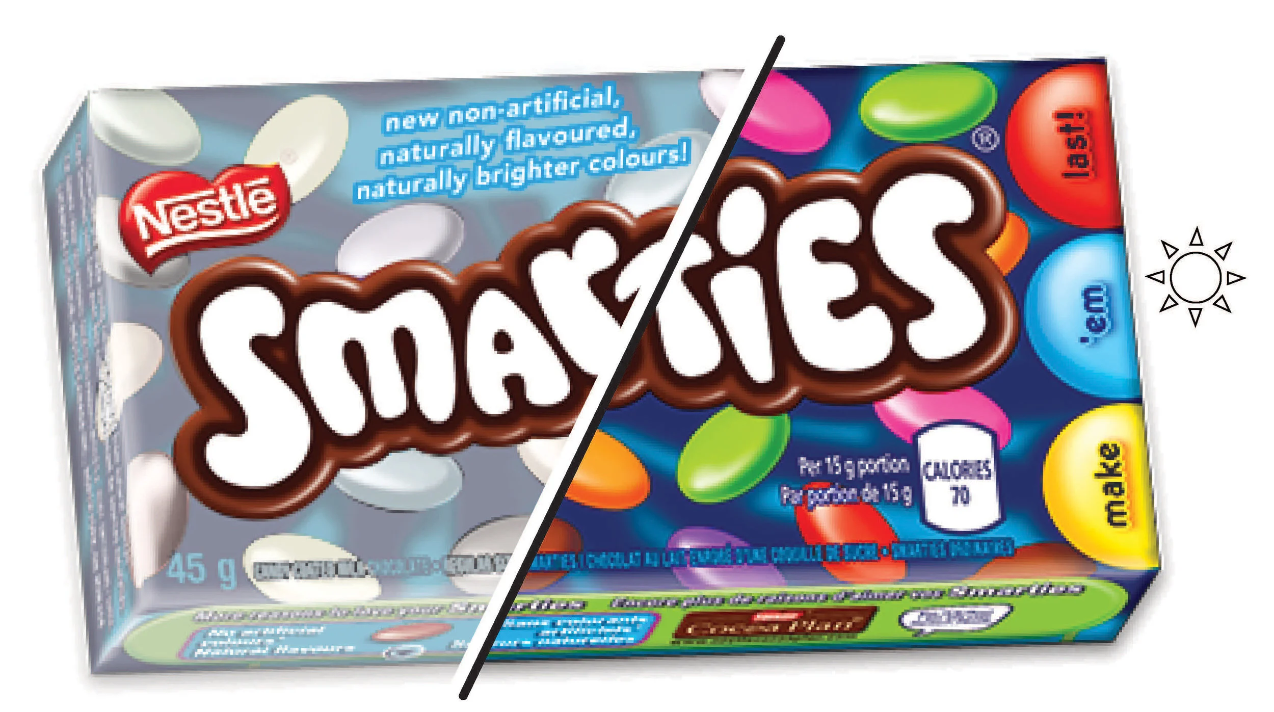


BRIGHTER COLORS. NATURALLY.
In the past, consumers have expressed that SMARTIES’ colours appear duller than before. We’ll show just how much brighter new SMARTIES’ non-artificial, naturally flavoured colours have become with the help of natural sunlight.
In the past, consumers have expressed that SMARTIES’ colours appear duller than before. We’ll show just how much brighter new SMARTIES’ non-artificial, naturally flavoured colours have become with the help of natural sunlight.
Art Director: Michelle Kennedy
Writer: Tiffany Chung
With photochromic ink, we’ll design new SMARTIES boxes that become brighter and more vibrant in color when exposed to natural light.
With photochromic paint, we’ll place SMARTIES messages on dull colored buildings and objects around the city. When exposed to sunlight the brightly colored messages appear.
Using the built-in light sensors on smartphones, we’ll create a mobile site where people can see the difference in SMARTIES’ colors by exposing their phone to sunlight.